Visual System
English Title - Poppins
Poppins is closer to uniform thickness, with large headline sizes that allow for more detail to be seen. The details in strokes resembling "regular circles" and "rectangles" give a more modern feel.
The thickness of the font can affect visual perception. We avoid using overly bold weights (which can feel too dense or heavy) and extremely thin weights (which can affect readability with too weak of a contrast).
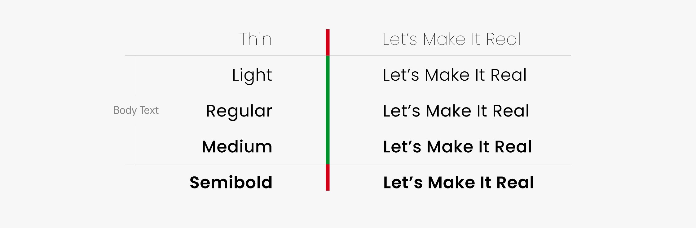
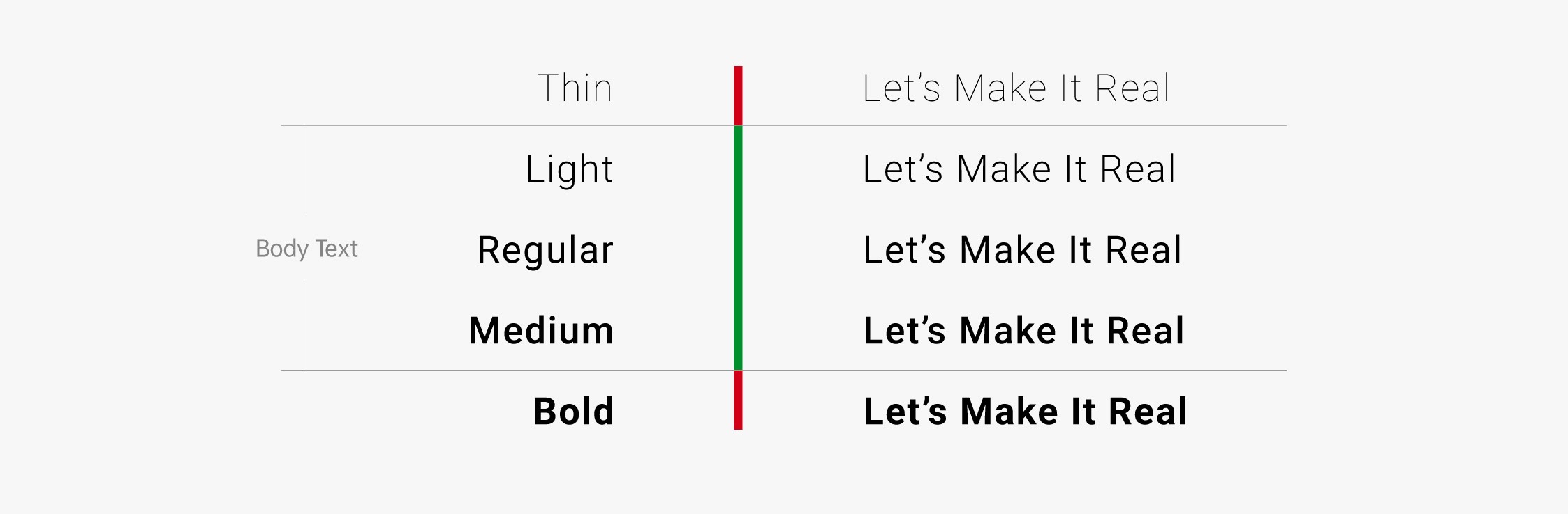
English Body Text - Roboto
Please use Roboto for the body text and do not use any other special fonts for the body text.
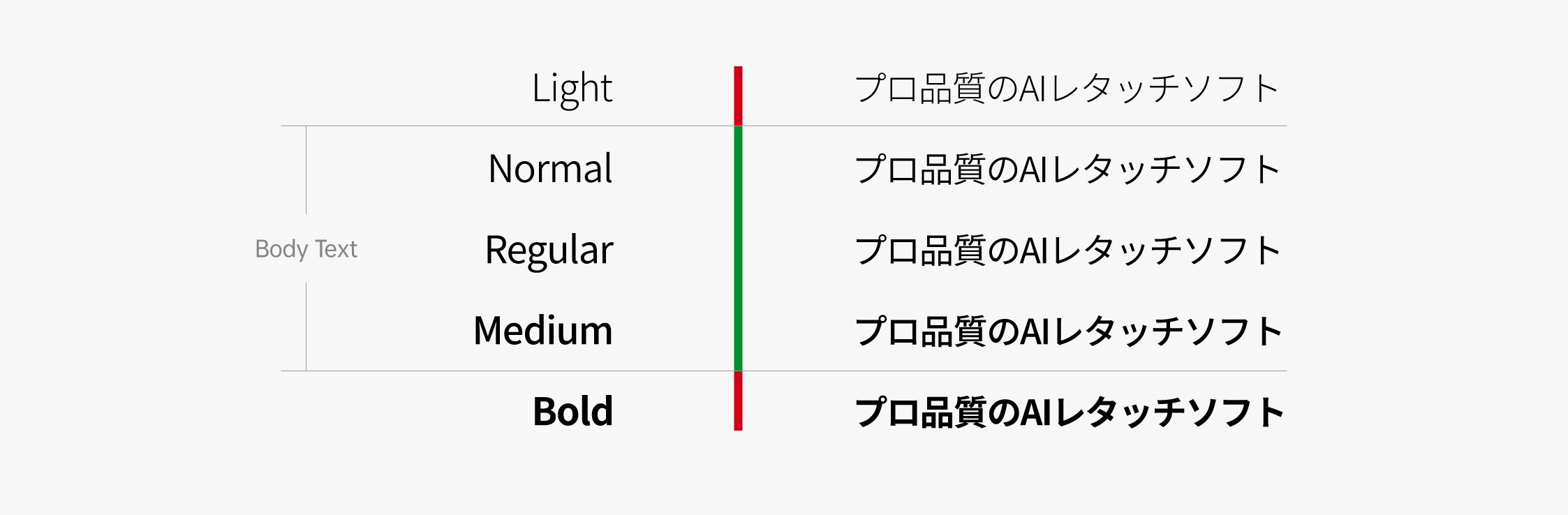
Japanese - 源真ゴシック
Gen Shin Gothic (源真ゴシック) is based on the open source font "Source Han Sans", modified and derived to support three languages: Simplified Chinese, Traditional Chinese, and Japanese. It retains the elegance and high readability of original Source Han Sans, and also offers 7 different font weights.