Logo Specifications
Origin of Symbol
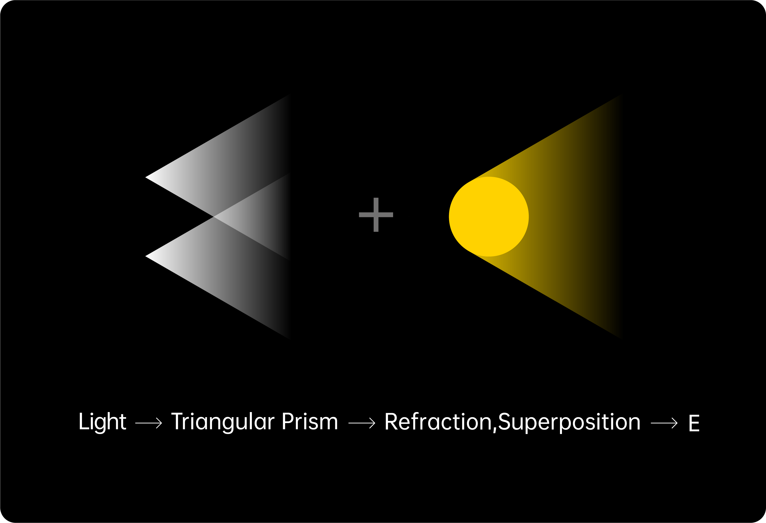
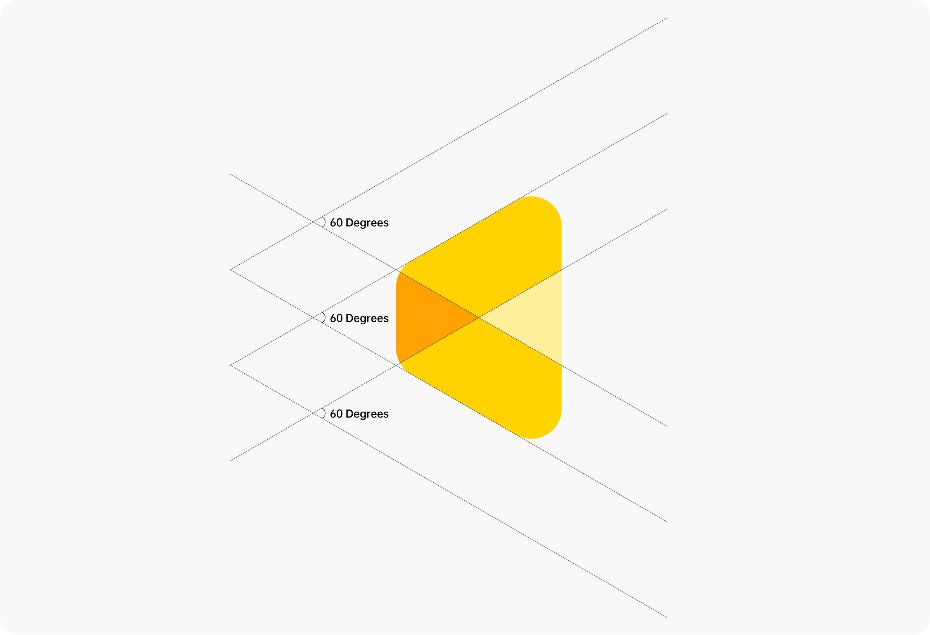
The design starts with light as its core inspiration. We incorporated the shapes of light, the idea of light refraction through prisms, and the distinctive letter “E” from Evoto into the symbol. This exploration, combined with the brand’s essence of cutting-edge technology, subtle professionalism, and dynamic illumination, has shaped the compelling and vibrant design you see today.
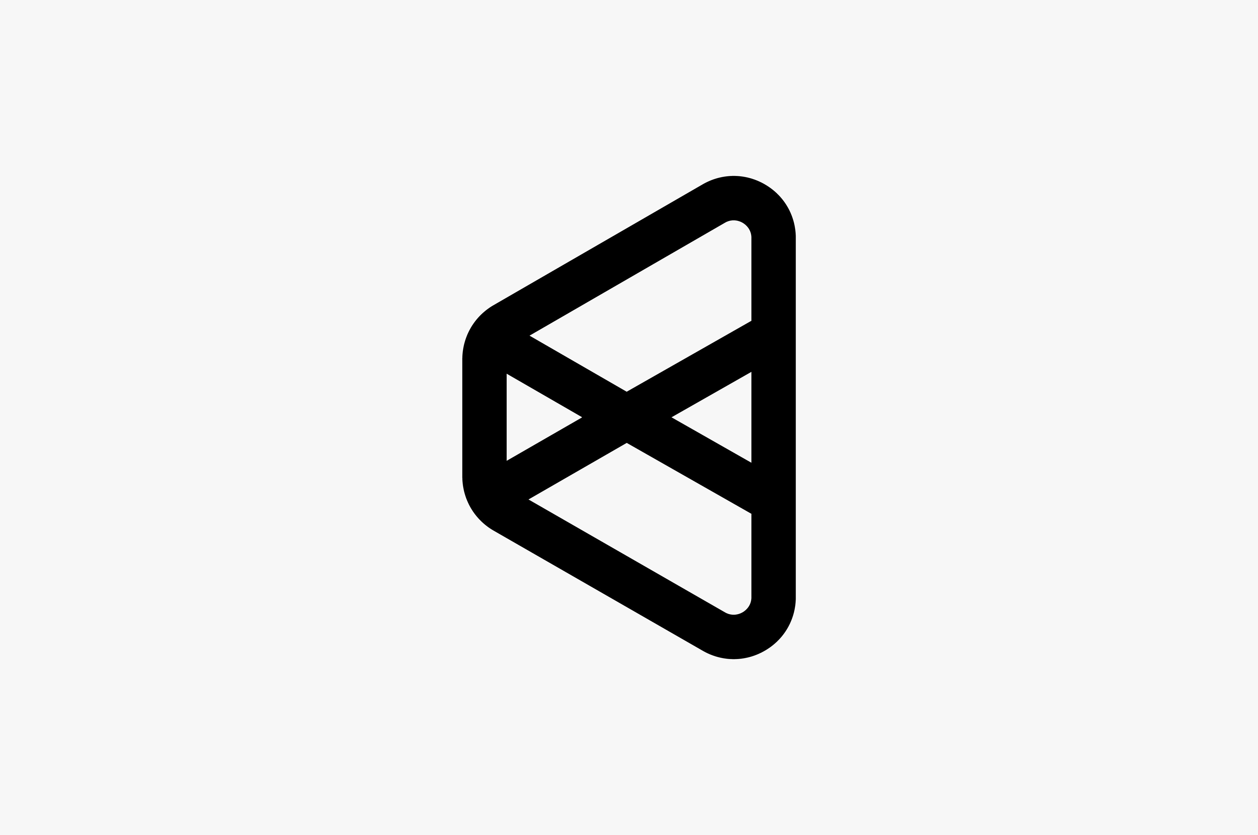
Symbol
If there is not enough space for the wordmark, the symbol may be used alone, such as for social media and website profile images.
When using the symbol independently, it is generally advised to use the full-color symbol.

Full-color Icon
Monochrome Icon
Logo
Basic
Slogan
Co-brand
Incorrect demonstration
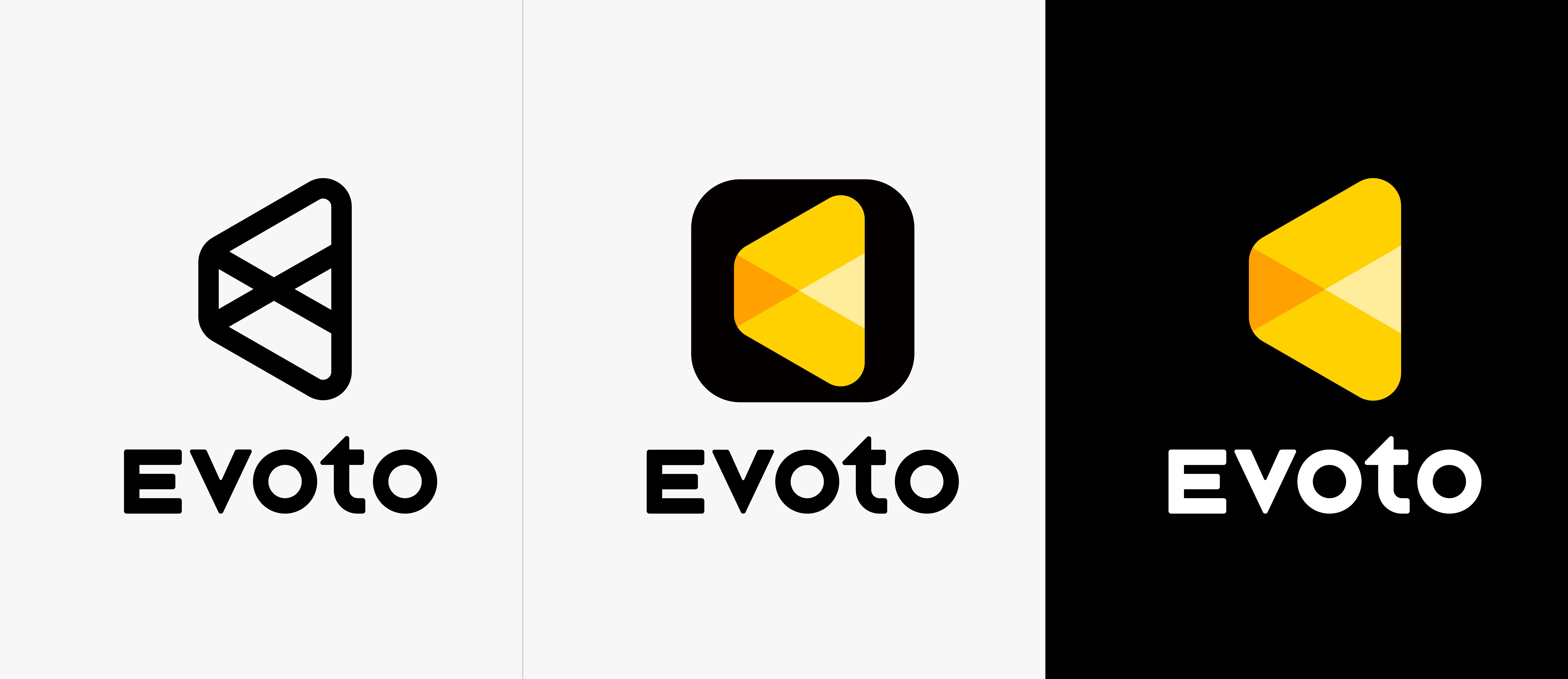
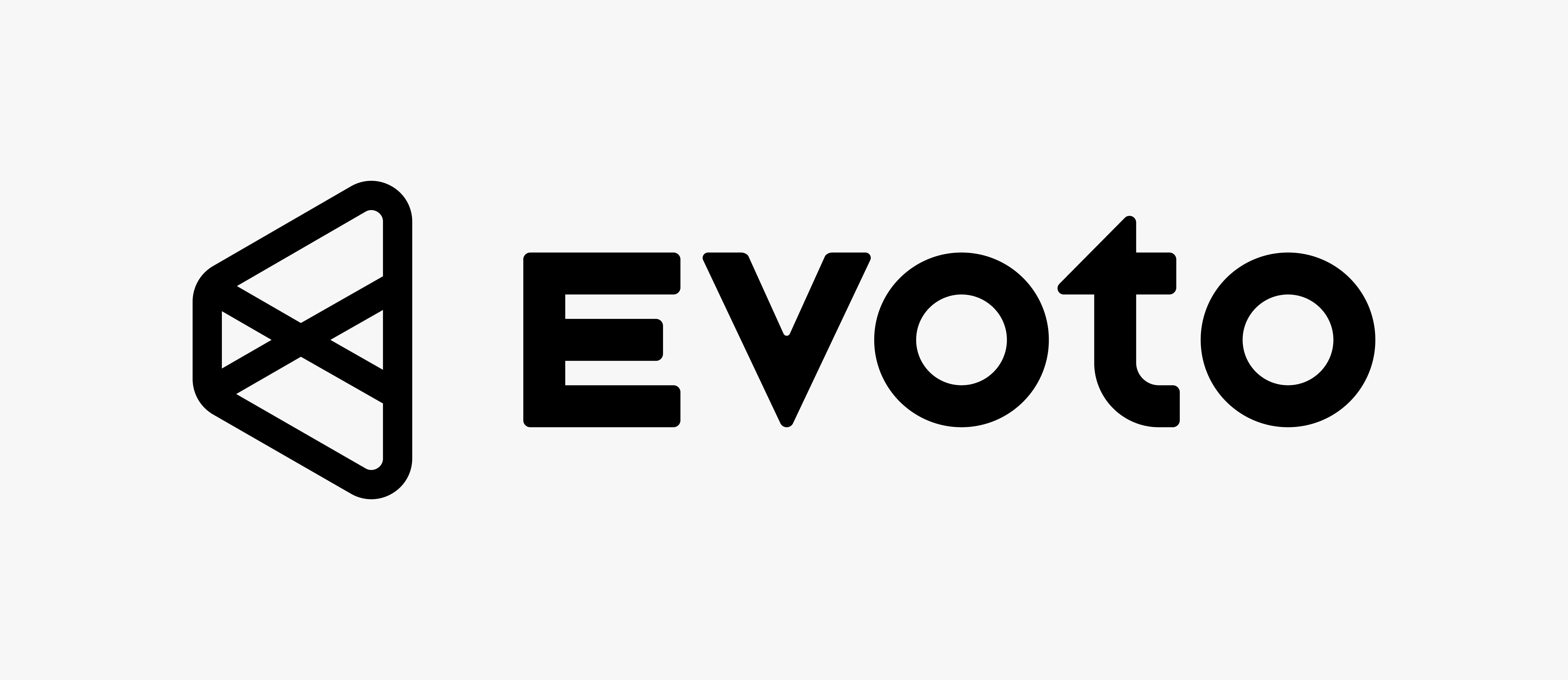
Monochrome Logo
The Monochrome Logo is our preferred brand expression. It should always be used in black or white. Choose the appropriate color based on color accessibility—we aim to pass a perceptual contrast (APCA) value of 60.
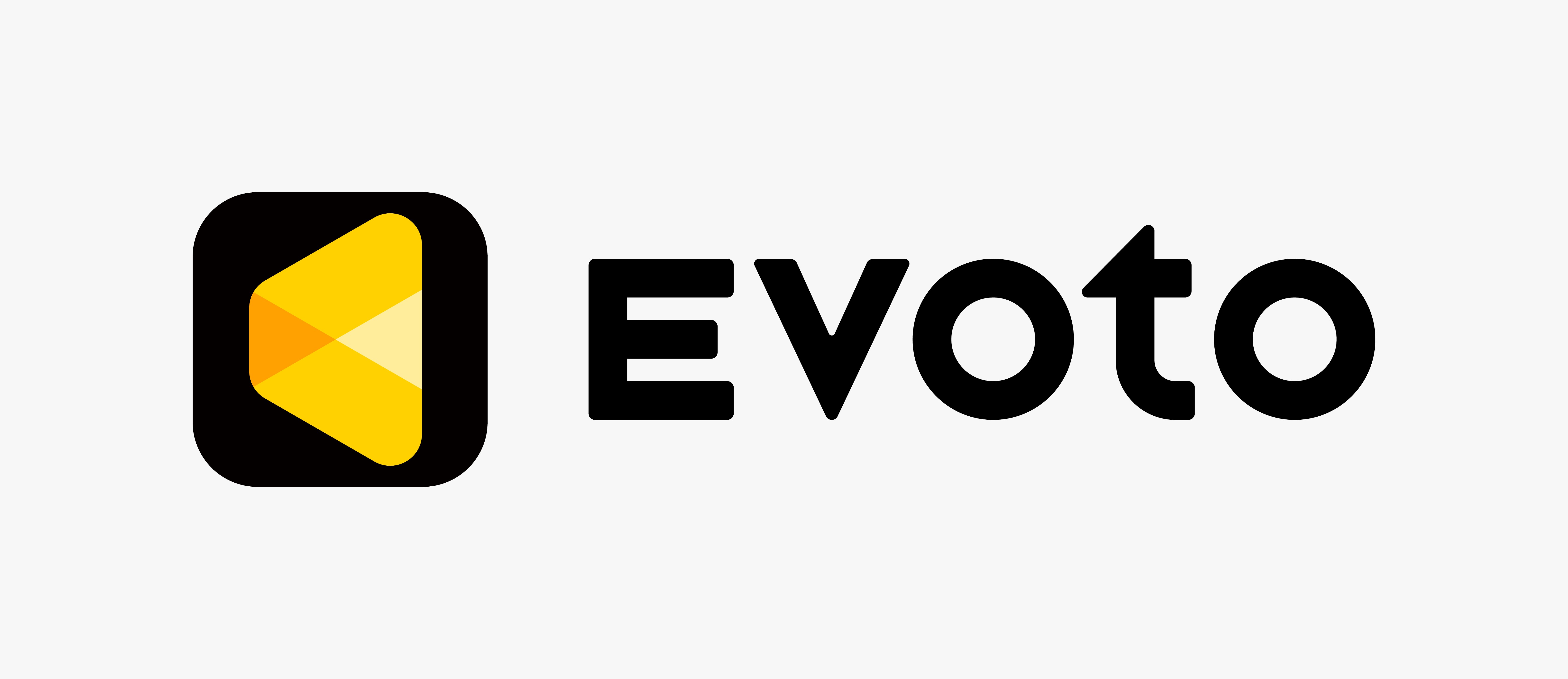
Full-color Logo
The Full-color Logo combines the app symbol and wordmark to enhance brand recognition. It is ideal for social media platforms or situations where brand awareness may be low.
No-background Logo
Use the No-background Logo exclusively on solid black backgrounds.

Vertical Logo
The vertical logo is best suited for square spaces. It maximizes the symbol's prominence and ensures readability in limited space.